While doing research for Libertarian Party Candidates earlier this month, I noticed that most of the more than 550 LP candidates running this year do not have websites. And of those who do, few are effective. By effective I mean:
Effective Candidate Websites are
- professional-looking and aren’t straight out of 1995.
- highly readable: good-looking large fonts and plenty of white space. Not overly “busy”.
- well-organized: clear navigation. Put the important information on the front page.
- interactive: the candidate communicates regularly and visitors can leave comments.
- easy to remember: a short domain with the candidates’s name and desired office.
Why are Candidate Websites Important?
Good candidate websites are critical! A website doesn’t cost much and once it’s created, it doesn’t require much work to maintain it. But it has a wide reach and can be a fantastic resource for press and bloggers who want to write about you. Without a website, your candidacy may as well not exist, but if you do it right – investing some thought and creativity – the impact can be breathtaking.
The Political Newbie who Raised $100,000 with his Website
Take the case of political novice and Democratic candidate for Kansas State House Sean Tevis, who produced a brilliant cartoon about running for office. Interest generated by Internet visitors resulted in $100,000 in contributions and positive nationwide press. Imagine if you could get these kinds of results from your website.
Let’s take a look at some LP candidate websites, what they got right and where they went wrong.
Wes Benedict
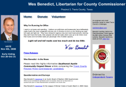
wesbenedict.com is a decent candidate website because it includes (1) a prominent candidate photo, (2) a short paragraph on why he is running and (3) information on getting involved. Also, it clearly says what office he is seeking.
But, while his sales pitch is in a good spot, it’s in a small font. This is his chance to define his candidacy – and he’s squandering it. Make the font bigger and perhaps put a light-colored background behind it. Also, he needs a weblog. I’d like to see invitations to upcoming events, stories about his campaigning, brief comments on relevant issues, photos and YouTube videos of Wes. This kind of content gets people excited and keeps them coming back to the website.
Rex Bell
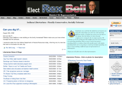
electrexbell.com is poorly organized. It’s “busy” – I don’t know what to look at first. He has irrelevant information such as lists of links and general news items taking up prime real estate. His sales pitch, while highlighted in a blue background and in the right place, is in a small italic font. This is just not inviting or easy to read.
On the positive side, the photos of the candidate campaigning show me that this guy is active – he’s for real. And he has a blog (though it’s neglected). Plus, you have to login to post a comment, which is an unnecessary barrier to getting valuable feedback from interested voters and bloggers.
Jason Gatties
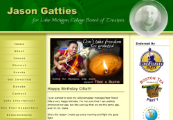
votegatties.org looks professional but the image of the candidate is obscured. People need to be able to see who their candidate is, to see his face clearly.
Prime real estate on the homepage is taken up by a plea for monks in Tibet. That’s just not relevant to the Lake Michigan College Board of Trustees, and should be removed. Replacing it with a good head shot of the candidate and a blurb about why he is running would be a major improvement because as it is now the front page doesn’t tell me anything about him.
James Frye
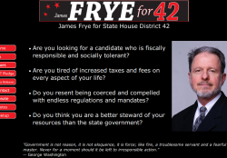
fryefor42.com benefits from a good domain. It’s short and reasonably memorable. His message resonates and the text is highly readable. It’s good marketing copy. His photo is large and professional.
Unfortunately, the black background he selected is counterproductive. It reminds me of an angry teenager’s rant page circa 1995. The photos he has hidden away in a subsection should be on the front page as they demonstrate activity and seriousness.
Michael Munger
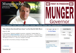
munger4ncgov.com is a professional-looking website with a prominent and outstanding photo of the candidate. The prominent blog post and multimedia show me that this candidate is active and serious. It lets me see what he sounds and looks like from the comfort of my home. His prominent request for donations is inviting and suggests an easy payment process.
However, the front page of the website doesn’t include any text telling me what he stands for. This is a glaring oversight. The event calendar is empty, which is worse than not showing it at all. And the ten options in the navigation bar are confusing – a limit of five to seven is advisable.
What Makes a Good Domain Name?
If a candidate wants voters, bloggers and the press to find his website, he needs a short, accurate .com domain name. The last thing you want to depend on is something like state.lp.org/candidates/my-name. No one will remember that. Domain extensions like .org and .us can also be ok, but a .com is invaluable as many browsers will auto-complete a text string with ‘.com’. Extensions like .net, .biz, .info, .name, .ws, .tv, etc. I do not recommend using at all.
Here are some good website domains that I found:
- jdhornbaker08.com
- benoit08.com
- boforcommissioner.com
- mcpherson4mayor.com
- buckleyforsenate.com
- vote-hodgkinson.org
- hogarth4house.com
- electberger.com
Here are some less than satisfactory website domains that I found:
- schansbergforcongress.blogspot.com: Not getting your own domain shows a lack of seriousness.
- alaskalibertarian.com/pages/scott_kohlhaas.html: Way too long, no one will remember it.
- s158460704.onlinehome.us: This screams lack of seriousness and it’s impossible to remember.
- whyliberty.com: Short but lacks the candidate name or office, so what is the point?
- timefordan.com: What’s his last name and what is he running for? No idea.
- theonlyteam.org/krista_goodwin: Was it an underscore or a dash? That alone will confuse the non-tech-savvy.
- markmcmains.com: But what is he running for?
A Plan for Better Libertarian Candidate Websites
Now that I’ve indulged in some criticism, I’d like to offer a plan for a better Libertarian candidate Internet presence, one where each candidate benefits from the following:
- his own domain name
- an email address (forward) @ his domain name (Gmail rec’d as email client)
- a good-looking website design
- the ability to manage his website using only his browser and a modicum of technical savvy
- a weblog
- the ability to publish “static” pages
- the ability for visitors to comment
- a contact form via which visitors can send a message to the candidate
- an easy way to take donations
- a sign up form for volunteers
- a file archive for downloadable campaign materials
- the ability to post multimedia: videos, pictures and audio files
- a listing of campaign-related events
How to Implement
I think the best software to implement this plan is WordPress, a free and open-source web application that is easy to install and maintain, that you can manage solely via your browser, that includes weblog functionality by default and has thousands of free themes and plugins available.
The domain name, DNS and email forwarding service can be obtained from pairnic.com for $19 per year, a reputable registrar who, unlike GoDaddy, is not known for indefinitely suspending domains for no reason.
Hosting can be obtained from many reputable companies for $10-$20 per month over short periods, but the many non-tech-savvy candidates will need support, too. We can save money both on hosting and support by centralizing all the sites together in one location.
But What will it Cost?
I’m confident I can provide the hosting for a low-traffic candidate website for $3 per month. Support could be sold for $60 per hour in increments of 15 minutes.
For a candidate who starts his campaign in March and ends it in November and who is able and willing to learn the basics of how to work with WordPress, he might need 2 hours of support over those 6 months. His costs would be: $19 for the domain, $18 for hosting and $120 for support for a total of $157. Rounding up to $199 and throwing in some howtos results in an inexpensive but full-featured IT department in a box.
Of course, a candidate who wants to outsource the entire operation or who wants a custom theme or more complex functionality, could easily spend $600 or more on support alone. The nice thing about this plan is that we can guarantee a low price for those who want a modern yet lean website, while also providing additional services to those who want them.
Are you Qualified?
What makes me qualified? I’m both a Libertarian and a veteran Unix systems administrator who has run hosting companies for the past 8 years. I’ve been working with and supporting customers on WordPress for most of those years.
I Can Implement Anytime
I have the ability to implement this plan anytime. Is anyone interested in a service like this?
I Need your Feedback
What have I missed? Please sound off in the comments.
Photo by jaqian. Some rights reserved.

12 replies on “LP Candidates Need Better Websites”
As both a Libertarian, and an employee of pairNIC, I enjoyed reading your article very much.
LOL, Thanks for commenting Dan.
All very true, and rather sad. A good website is generally *much* cheaper than a television ad campaign, and these days can be just as important.
Well, spent aprox 30 mins looking for information on billoliver, all i could find out that he was a short haired guy in a white shirt standing close to a door! guess who i am not voting for? discusted, Marge
Here is slightly more information on Bill Oliver, a candidate for TX state senate: http://www.votesmart.org/bio.php?can_id=102104
Hope that helps, and I’m sorry to hear about this.
Where were you when I needed you…
I just figured out how to get my DVD copied and converted to be able to put it on Utube and now you’re telling me I could have had it all in one place… other than our State LP’s website without even my name in the website. But I wouldn’t have had the materials I needed developed until more recently so wouldn’t have been able to take advantage of your expertise on this run.
You live and learn…
If I run again, I’ll be in touch!
Bummer Darlene, but definitely let me know if I can be of assistance in the future. Thanks for commenting.
It’s very sad and very true that so many of the candidates don’t have any websites or information online.
There are people like Sean Patrick Morse who I’d be interested in possibly voting for, if only there was somewhere I could read about views, what they plan to do, what they’ve accomplished, their stand on issues etc. etc.
It’s insane to me that people running for office have no website or online presence, AND they don’t even fill out the forms on sites like vote-smart to show what their views are!
If you want people to vote for you, you need to have a website and you should make sure your website appears in online searches, especially for your name.
Rebecca I can’t tell you how many comments like yours I have gotten.
I know we’re going to work on doing this better in ’09 and beyond.
Thanks for commenting!
I asked you somewhere else why WordPress, rather than Publisher, which I kinda know.
And today, I found out.
WordPress is so freakin’ easy. Simple. Clean.
Thanks for what you did with this, George.
Rachel, I must have missed that question. Apologies.
I’m not sure I’ve heard of Publisher but the benefits of WordPress IMO are:
– free, open source
– very flexible, can be used for many kinds of websites
– very easy to work with
– mature code case, been developed for years
– large number of useful plugins and attractive themes available for free or little cost
– low resource usage, not complicated to work with
– can host it very cheaply
– in active development by large group of people, so security fixes come out fast
I’ve probably missed some.
Hope this helps. :)